Top UI/UX Trends You Should Know in 2021
.png)
The UI and UX Design are critical in gaining consumer trust and encouraging them to utilize your app or website to get what they're looking for. The success of strong UI and UX may be measured by the amount of customers who visit your website/app.
We’re halfway through 2021 and it’s time to look at the new and upcoming trends in the world of UI/UX to help all you creative minds get an idea of what all design concepts you can experiment with in the latter part of 2021 and right into 2022. So, are you ready?
1) A Palette of Pastels
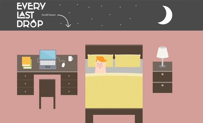
Designers frequently utilize pastel colours in their work because we live in an age of simplicity and simple web design. In this approach, they emphasize the design's lightness and unobtrusiveness. Such colours go well with a wide range of ideas. They set the right tone and mood for different websites.
The Every Last Drop website is a good example.
2) The Mobile First Approach
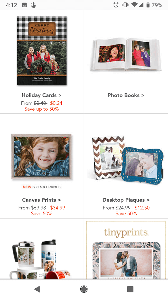
Web design should no longer be limited to the desktop version of your website or app. As a result, the mobile-first strategy has emerged as a significant UX trend. It's a fantastic way for web designers to improve customer engagement.
The following snapshot of the mobile website of Shutterfly is a good example.
3) Use of Intuitive Icons
Customers benefit from the use of icons as a visual communication tool. A prominent UX trend is the usage of basic minimalistic icons. It all boils down to their ability to express meaning in a fraction of the time it takes for words to do so.
It's best if you stick with symbols from the same family. It's best if they're all the same size and form. This level of regularity showcases your ability while also emphasizing your website's trustworthiness.
The icons used in the Digital HRMS website are good examples.
4) Glassmorphism & Neomorphism
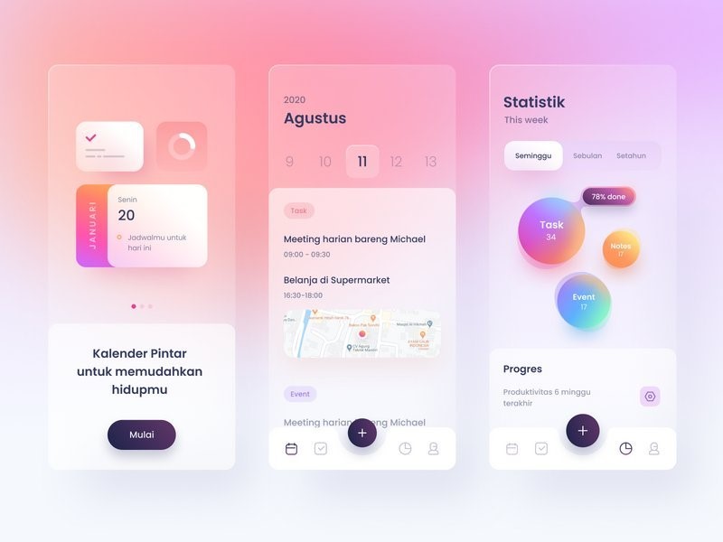
In the year 2021, web designers developed a new obsession: glassmorphism.. The blur effect, or so-called blurred background, is the source of this trend. When people look at such an element, they appear to be peering through the glass.
The following is a glassmorphism template by designer Ghani Pradita.
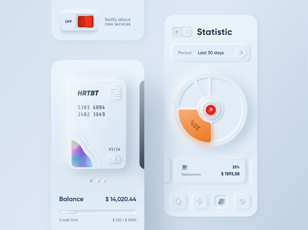
Neomorphism is another trend that is worth mentioning here. One of the most popular UI/UX trends in 2020, neomorphism is here to stay, say design experts. It’s a modern take on skeumorphism, which is a term used to define the concept of designing user interface with elements that look like real world items. Neomorphism is inspired by minimalism, and is all about flat designs using simple flat elements and flat solid colors for a simplified user experience. Given below is a neomorphism template by Alex Plyuto that popularized neomorphism.
5) Onboarding No Longer a Bad Design Idea
A brief introduction to a product that allows you to learn more about it is known as onboarding. It also makes its basic functions easier to comprehend. Whatever the case may be, onboarding has become a major UX trend that should not be ignored.
The onboarding screenshots of the Digital HRMS Mobile App are a good example.
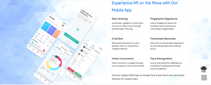
The most critical screens of mobile applications are included in modern onboarding. Users gain a better understanding of the app's capabilities as a result of them. We advise you to keep onboarding as simple as possible. Pay close attention to the wording and make it as concise and as easy to understand as possible.
Are you experimenting with these trends already? Which one is your favourite? Share your thoughts in the comment box below. Have fun as you explore these trends and more.

