A Brief Introduction to the Basics of Bootstrap

Every business needs a website today to reach out to a wider base of target audience. The rapidly increasing growth of mobile users means that the digital blueprint of every business should focus on catering to the needs of the mobile users. So, no matter how powerful and effective your website is, it will always fall short of impressing a large section of your target users if it’s not optimized for the mobile. Picture this:
Google Research data shows that 72% of consumers want a mobile-friendly website.
This is where there comes the need for a framework that can be used to build reliable highly responsive mobile-first websites that are designed to provide optimum user experience to mobile users. Responsive website design is the approach of website development that aims at building websites that are fully functional, easily accessible and also look good on all devices, including small smartphones & tablets. Bootstrap is a powerful platform for this purpose and here we shall look into the basics of Bootstrap and its role in creating rich, responsive web pages.
What is Bootstrap
Bootstrap by Twitter is one such framework that was first developed by Twitter and is so versatile that it can be used to develop anything from web apps to themes on WordPress. Almost every web developer today is familiar with Bootstrap – the world’s most popular framework to develop highly responsive mobile-first sites. A free framework, Bootstrap allows web developers the freedom to customize and create highly responsive designs real fast and with minimal efforts. The framework offers users a collection of templates for every element of a web page – forms, buttons, typography, navigation, tables, modals, image carousels and more. It also offers JavaScript and jQuery plug-ins for additional functionality on the web-pages and supports all major browsers and their versions. Bootstrap offers developers many shortcuts to develop web pages in the least time and with minimum efforts.
Why Choose Bootstrap
There are many advantages of using Bootstrap for developing mobile friendly websites:
- Easy to Use: One of the primary advantages of Bootstrap is its ease of use. All one needs to get started is a basic knowledge of CSS and HTML.
- Designed with a Mobile-First Approach: Designed with a mobile-first approach, you don’t need to look further when it comes to finding the most powerful framework for developing mobile websites that offer maximized user experience.
- Supports all Browsers: Today, we have several browsers like Chrome, Opera, Firefox, Safari, IE, just to name a few. Add to this a list of the various versions of each of these browsers, and you’ll have a long list of browsers to check the compatibility of a website. Bootstrap takes care of this all to ensure your users get to experience your website to its fullest, irrespective of the browser they’re using.
- Offers Maximum Responsiveness: With Bootstrap, responsiveness is something developers don’t need to worry about. Its CSS is designed for maximized responsiveness, be it on desktop, smartphones, laptops or tablets.
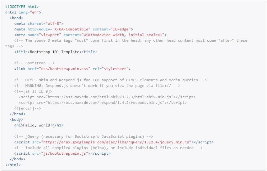
Getting Started with Bootstrap
In order to get started with Bootstrap to build responsive web pages, one needs to have a knowledge of the basics of HTML and CSS. The framework offers templates for developers to build a website. Given below is an example of a Bootstrap template.
To get started with the free Bootstrap framework, one needs to download the latest version from the website.
The Bootstrap package includes over a dozen custom jQuery plugins, which can all be included together, or one by one. What makes the framework really stand out is that it allows users to carry out complete customization of its components to build a unique version of the platform.
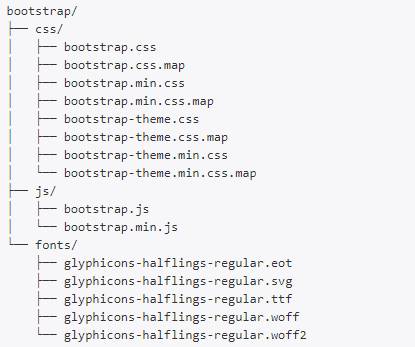
Once you have the compiled version Bootstrap downloaded, the next step is to extract the ZIP file, and you’ll see the following file/directory structure:
The Bootstrap Grid
The official documentation defines the Bootstrap Grid as “Bootstrap includes a responsive, mobile first fluid grid system that appropriately scales up to 12 columns as the device or view port size increases. It includes predefined classes for easy layout options.”
It’s a mobile-first grid, which means the code starts with targeting smartphone and other small screen devices and then “expands” the components of the grid, as well as the grid itself, when designing for larger screens, such as laptops and desktops. The grid is useful for aligning the content and various elements on a web page.
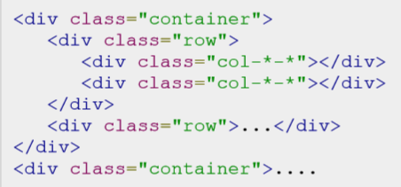
Following is basic structure of Bootstrap grid:
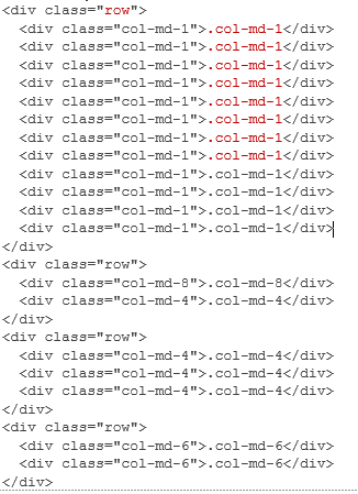
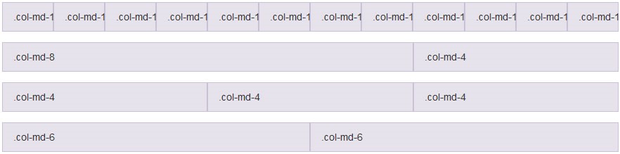
Here’s an example of the 12-column Grid structure in the code format:
Also, here’s the output you see:
Adding to the Look and Functionality of the Web Page
Bootstrap offers more than just the option to fix the layout of the webpage with ease. It also allows the web developer the option to add to the functionality as well as the visual appeal of the page using CSS styling and Bootstrap components.
Some examples of CSS styling options include adding different types of tables, forms, changing the typography of the page, styling of the embedded images, shapes of buttons, and more.
Also, there are various Bootstrap components that are a part of the package that you download, and they can be used to enhanced the aesthetics as well as the functionality of the webpages. Some examples are drop-downs, button groups (series of buttons in a single row), glyphicons, button drop-downs, navbars (navigation headers), breadcrumbs, pagination, progress bar, and more.
Bootstrap is a great framework to work when developing web pages for different devices and for a wider target audience. Even beginners can get really creative with this framework because of the easy interface, many features for customization, and ease of adding elements to a web page. This is the reason it has emerged as the most popular framework for web development today.

Write a comment
- Mukulika M November 16, 2019, 3:51 amVery nice blog!reply